
Guide for Font Pairing: Crafting the Perfect Typography for Your Website
Pixbrand Team
Published: 21/11/2024
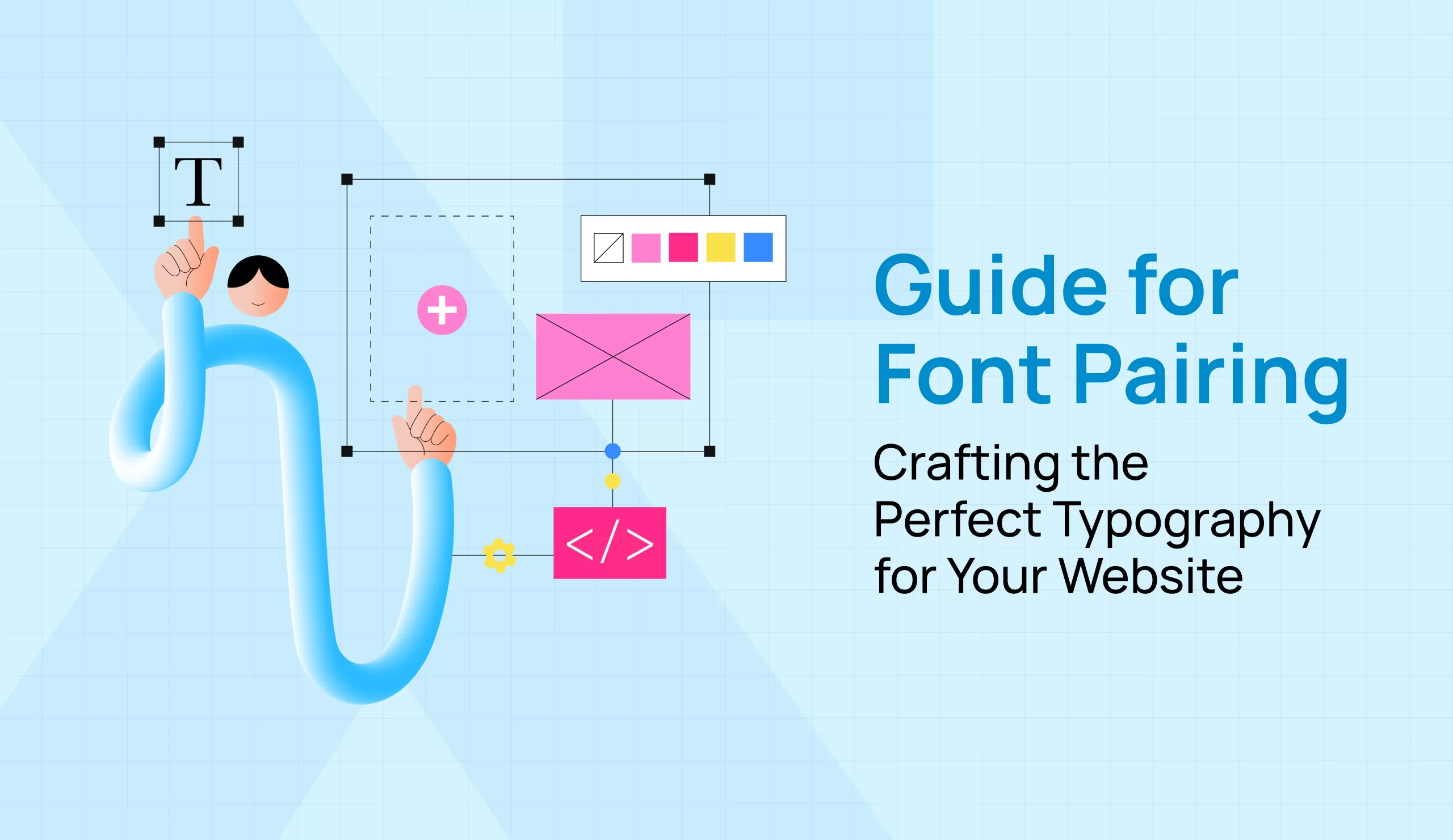
Typography is a powerful tool in web design. The right font combination enhances readability, establishes brand identity, and sets the tone for your website. But let’s face it—choosing the right fonts for your website can feel like a daunting task. We’re here to help you make sense of the art of font pairing. This guide will walk you through the fundamentals of font pairing, helping you select the best font combinations for your website.
Understanding Typography
Before diving into the technicalities of font combinations, it’s essential to understand typography’s role in web design. Typography is more than selecting beautiful fonts; it communicates mood, structure, and emotions to your audience. Fonts shape how users perceive content, and a well-thought-out pairing creates hierarchy and flow in a design.
When thinking about font combinations for websites, it’s important to recognize how different typefaces—such as serif, sans serif, script, and display—interact. Balancing these styles ensures readability while creating a clear visual hierarchy.
Identify Your Brand
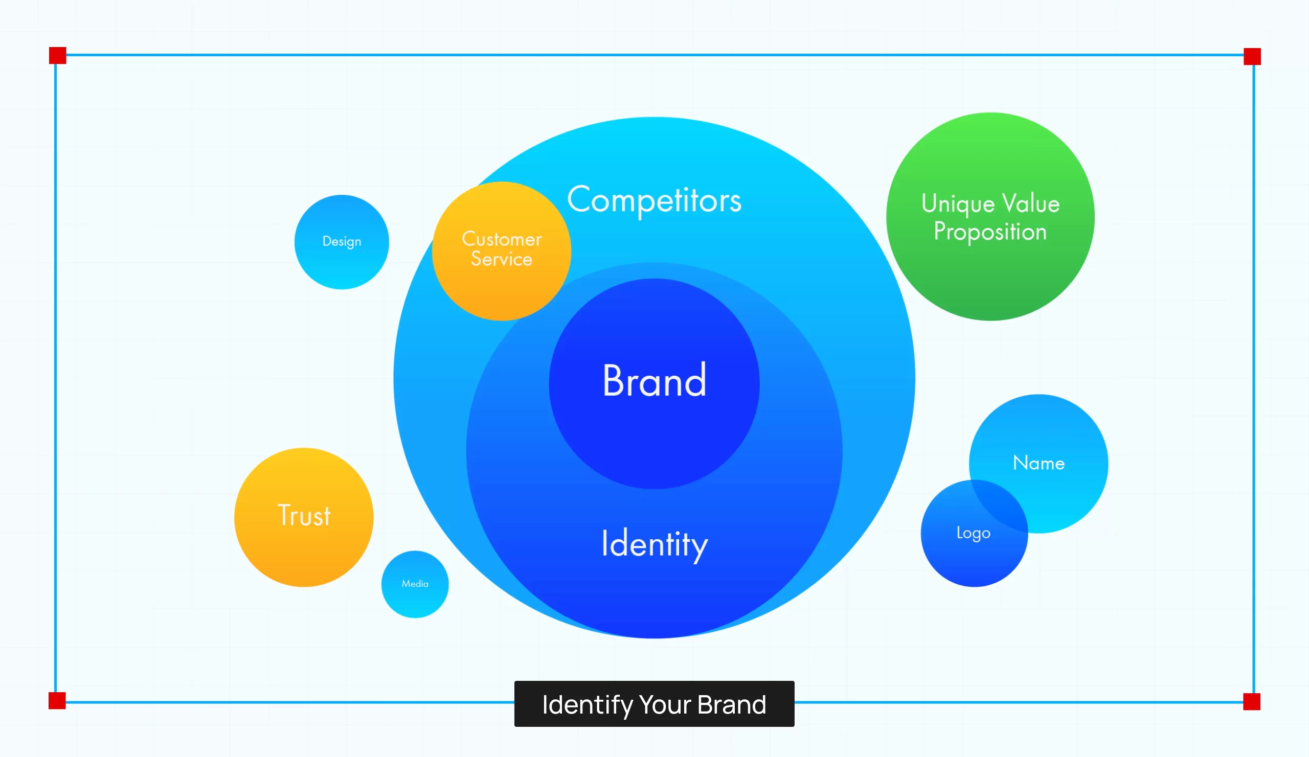
Your brand’s identity is at the core of your font pairing strategy. Typography should complement the brand’s message. Is your brand modern and bold, or traditional and understated? These qualities will guide your font choices.
- Serif fonts (e.g., Times New Roman) signify tradition, elegance, and authority. They’re a great fit for brands such as law firms or financial services.
- Sans serif fonts (e.g., Helvetica) feel simple and modern—ideal for tech startups, fashion brands, or lifestyle blogs.
By identifying whether your brand needs a formal or informal touch, you can narrow down your choices, bringing you closer to the best font combinations for your brand’s voice.
Find Fonts That Convey Your Brand
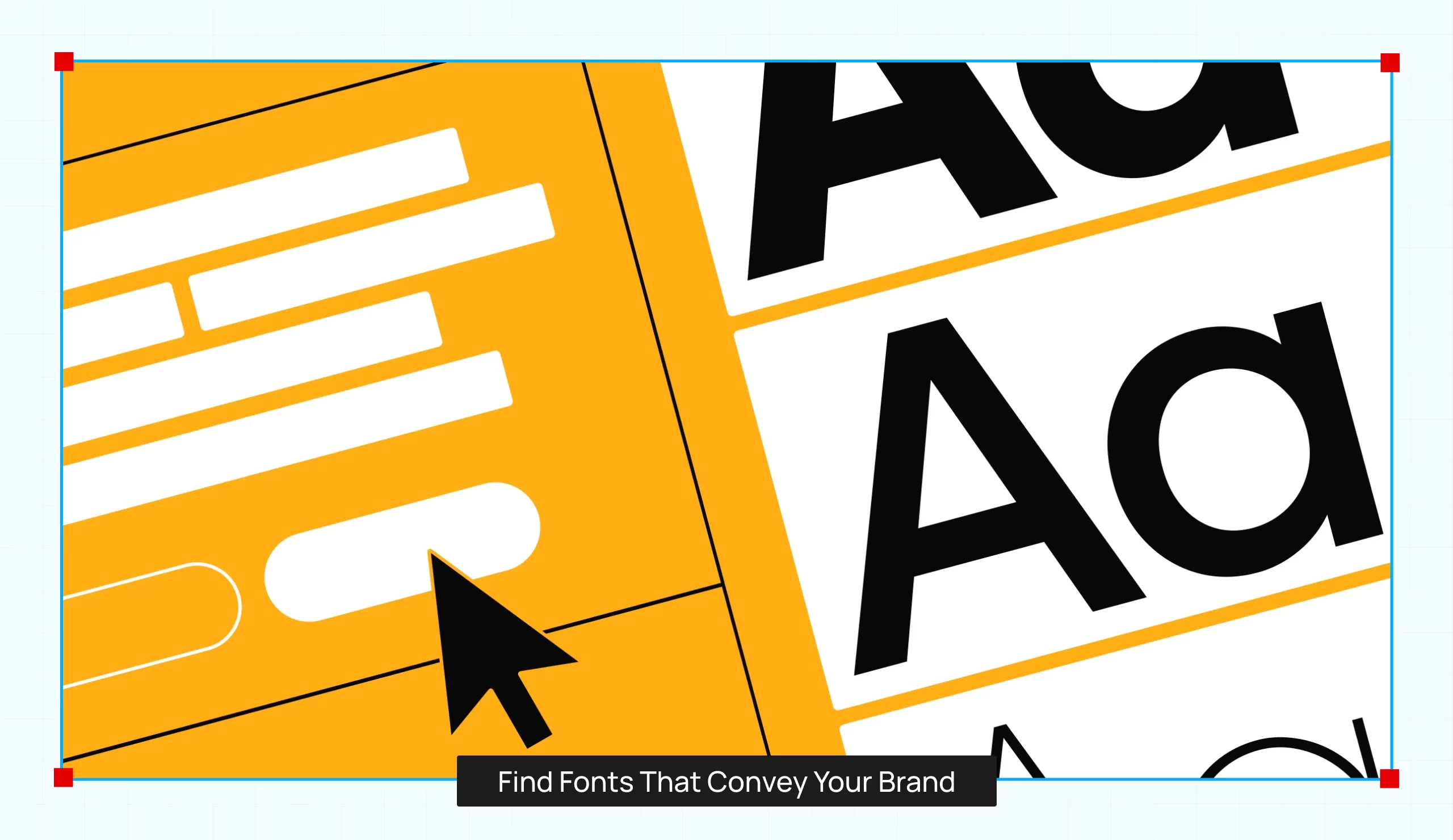
Once your brand’s identity is clear, it’s time to find fonts that convey that message. Start with an “anchor font”—which will appear most frequently on your website. This font can be used in headlines or major call-to-action buttons, setting the tone for the entire site.
For instance, pairing a bold sans-serif font for headings with a minimalist serif for body text creates a beautiful contrast. This combination works well for modern brands that need to blend professionalism with creativity.
When experimenting with font combinations for websites, preview your selections side-by-side to test how they look together.
Choose a Font for Body Text
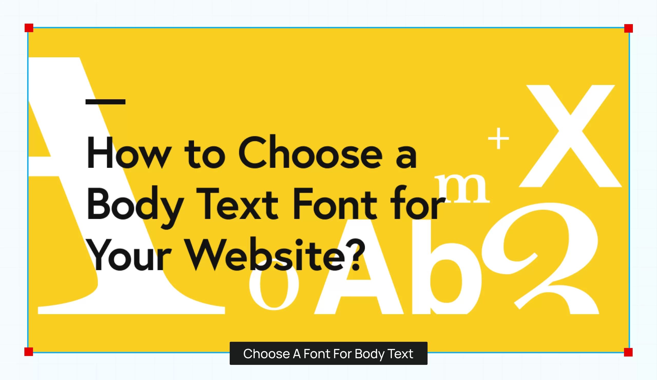
Body text is the part where readability matters the most. While the headline font may be bold or artistic, the body font should be subtle and easy to read. Clean sans-serif or classic serif fonts like Georgia or Times New Roman work well for longer text due to their high legibility.
Fonts like Lora or Roboto make excellent pairings with decorative headline fonts, ensuring the content is engaging yet readable. Avoid overly stylized fonts as they could make reading difficult.
Set Rules for Your Font Pairing
After choosing your fonts, it’s important to create rules about how they will be used consistently across the site. Setting these rules ensures font combinations stay cohesive and polished, contributing to a seamless user experience.
Consider these tips for using your fonts effectively:
- Create a visual hierarchy: Use different fonts for headings, subheadings, and body text. This helps break up content and guides the reader’s attention.
- Contrast is key: Fonts should contrast in style but complement each other. A serif font combined with a sans serif font creates a nice balance, helping important information to stand out.
- Use font sizes and weights wisely: Play with font sizes and weights to create emphasis. A good font pairing provides flexibility regarding weights (bold, regular, light) and styles (italic, regular). This adds dynamism to the design.
- Mind the spacing and alignment: Pay attention to letter spacing, line height, and alignment. No matter how great your font pairing is, poor spacing can make your content harder to read. Ensure the spacing between lines and letters is optimized for an organized look and easy readability.
Final Words
Mastering the art of font pairing is more than just picking two good-looking fonts. It’s about balancing aesthetics with functionality. Choosing the right typefaces that reflect your brand, sets them up in a way that guides the reader’s eye, and ensures a seamless user experience.
Whether you’re designing for a professional business or a creative project, the best font combinations can transform your site’s design from average to outstanding. Need help perfecting your website’s design? PixBrand specializes in crafting unique, user-friendly websites that make your brand stand out. Let’s create something amazing together!

TABLE OF CONTENTS
Lorem ipsum dolor sit amet, consectetur adipiscing elit. Ut elit tellus, luctus nec ullamcorper mattis, pulvinar dapibus leo.