Pixbrand Team
Published: 02/02/2024
- App Development
- Digital Marketing
- Ecommerce
- Seo
- shopify
- UI/UX Design
- Web Development
- woocommerce
In the world of screens and flashy light, our eyes do more hard work than we do. And to ease the efforts, dark mode steps in offering a respite and captivating aesthetic. Today, 80% of people prefer dark mode on their screens for all apps and websites. Is it only about the minimal aesthetic design or something more?
Dark mode best practices are not only about integrating the theme for a visually strong interface but also a user experience with less effort. From social media platforms like Instagram to productivity powerhouses like Slack; the use of Dark themes is increasing in apps and websites constantly. As per reports, it reduces eye strain, improves the battery life of the device and gives a much more comforting screening experience.
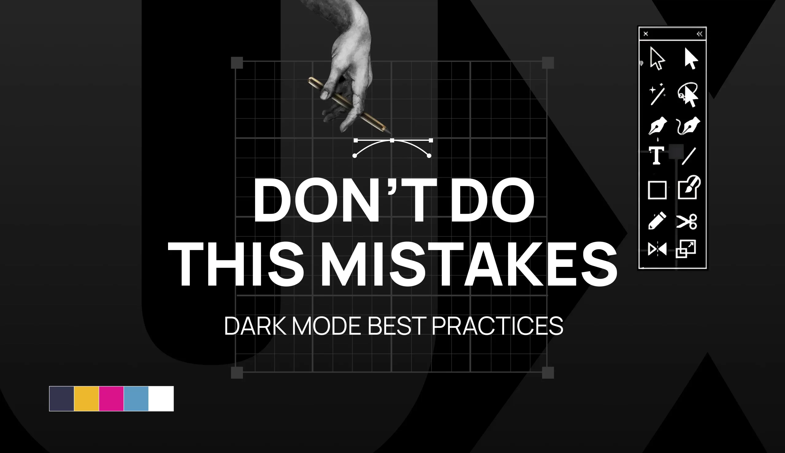
However, creating an effective dark mode color code is not simple as it is an art of contrast, palettes, accessibility and user experience. This blog will help you to understand the best practices along with do’s and don’ts while developing a dark theme.
11 Dark Mode Best Practices for UI Design
Balancing Colour Saturation for Dark Mode
Ever experienced discomfort in vision due to vivid colours on a dark background? That’s saturated colours leading to the strain and becoming the real problem in meeting accessibility standards.
Accessibility standards are essential while developing an online platform. The secret is to strike a balance between dark themes and contrast colours. Pixabrand agency goes for 20 points less saturated in dark mode compared to light mode.
Finding the sweet spot is quite challenging in a dark colour palette. Too much saturation can cause strain in the eye and affect user experience. All the colours must be accessible to all people, even those struggling with visual impairment.
Avoid White Fonts for Readability
Text is the silent hero in the User Interface of dark mode. It can either make the digital platform look more appealing or destroy accessibility. The problem can be solved with opacity.
Let’s accept this myth, that pure white fonts on black or grey backgrounds go well. This blend of white and dark background leads to blurriness and distortion due to optical illusion games. The white light from the screen tries to penetrate the dark space giving a bad display.
Go for subtler shades like dim white or light grey as it gives a nice play with a dark background to ensure your text stands out with a clear display. According to Google 38 % for disabled, 60% for medium emphasis and 87% for high emphasis text is the right opacity.
Opacity is not only for aesthetics but to give a perfect display and reading experience. Shine brighter without compromising on readability.
Use Beyond Pure Black
Black is the first choice when it comes to dark theme UI. Let’s break your heart that pure black might not be the design hero – it could end up causing harm to visuals. So, it is black vs grey!
Imagine a black background with white design elements, putting unnecessary strain on the eyes. Dark grey is your colour to give a sophisticated look in the background and light grey for bright white.
Choose the right shade that signs in harmony with your brand identity. Design is not only about visuals it’s more about telling a story. Embrace the shades of grey to craft a unique identity for the brand.
Don't just invert the colour scheme
Switching from light to dark mode is not a matter of just changing the colour scheme; it’s more of having a whole experience. Inverting can be very stressful on the eyes of the user due to improper colour schemes and UI design elements.
Creating a dark colour combination is not only about designing a theme of a black background but also using enough contrast that will be easy when switching the modes. Consider it as crafting a whole new colour palette while keeping other designs in mind.
The hues should play well together in terms of environment, screen and device. Take time to craft a dark mode with a good palette that not only feels visually appealing but also comforting. Play well with colours to make both themes successful for a rich user experience.
Focus on the Browser Indicators Visibility
Ever seen someone navigate the whole website and apps without using a mouse? It’s because of mastering the art of keyword commands to explore through the whole digital platform. Also, it can be done by people with some physical disability.
Make sure all the focus indicators are there in your dark theme and don’t forget to make them easily visible. Along with usability, focus on inclusivity for everyone.
You can contrast
Dynamic Brand Presence with Same Colour
Don’t replicate the same colour of your brand in a dark theme, groove with the essence of it. Avoid the total inversion, pick your brand colour the one that is your brand’s true identity and use it in the dark theme mode.
When you use the primary colour on key elements, it might look very odd. While using the primary colour in multiple places, keeps your brand identity alive thoroughly. It’s like a subtle nod to your brand’s signature hue and integrating it into a darker theme.
Don’t Lose Brand’s Identity
Many brands lose their identity in the design of dark themes. As dark color combination has its own solid personality; adjusting the tone of colours with the backdrop is essential. The balance of the sweet spot with the colour palette evokes the right emotion of the user.
Why not explore different modes in both light and dark themes? Your brand can have a different impression for certain audiences. Embrace this adventure and explore the wide dimension of emotions.
If you are given the choice to switch between light and dark mode; embrace the canvas of dark mode with different elements. Use the opportunity to expose the different dynamics of your brand.
Using any app or accessing a website is not a one-time experience, it is a whole journey from visiting to finding the significant journey. Meanwhile, keep your brand personality alive and outshine better with dark themes.
Communication Depth with Interface
Dark design doesn’t mean you can’t experiment further with design elements and layouts. Apart from relying on shadows, there are numerous tricks to guide the user through the interface’s visual hierarchy. Know how to do it
- Minimalistic looks more pleasing and realistic. Dark colour is minimal but needs space to breathe. Make your layout simple, and create spaces that allow users to rest.
- Contrast between the objects and heavy lifting to create a visual depth without leaning on shadows.
The design should be easy to navigate and effortless. Using negative space mindfully and playing with contrast and lighting, you can interact with the user.
Avoid Shadows for Better UI
Shadows can be the secret agent to elevate any UI design to distinguish between the spotlight and background elements.
But, when it’s about a beautiful dark theme color palette things are quite tricky. Imagine a black background with black shadow and there’s not much contrast here. Know how to decode the shadow game in the dark theme:
- Don’t outshine the background because it’s tempting to crank up the shadow intensity and this only can be done with eagle eyes. The shadow must not steal the highlight of the background.
- Imaging objects emitting lights instead of casting shadows, so avoid lighter shadows. Lighter shadows might jazz up your UI visually but it won’t serve the primary purpose.
Shadows should be easily blended with the background subtly guiding users to navigate the highlighted elements. The primary concern should be easy navigation and user experience not only visual impression. Use the shadows as the supporting actor and outshine the beauty of the dark theme.
Give User a Choice To Switch
Dark themes are cool to grab users’ attention, but you know what’s cooler? Putting the power in the hands of users to switch between different modes whenever they feel like it. Offering a switching option is a win-win situation because:
- Empowering user’s choices and tastes by giving them the power to switch between modes. After all, a bit of freedom can enhance the experience altogether.
- It’s like showcasing that you really care about their preferences and want them to have a rich website experience. Another way to get loyal users.
Besides this, giving both light and dark modes is like satisfying all the users who have different tastes and comforts.
Testing Dark Mode with End-Users
Dark mode introduces a unique challenge of designing a platform according to the various lighting conditions. Every device has a different lightning setup and it’s like designing for a million different screens. It’s necessary to ensure the solution with end users by putting the app and website or product’s dark mode through the ultimate user test.
Here even before aesthetics, MVP is the primary concern. Here’s why testing with end users can make the dark theme a game-changer:
- Testing helps to find the loopholes and dodge them by analysing the user interaction with the design
- You and the user both don’t want to have “that’s not what I signed up for “ moments and testing lets you ensure that your design is aligning with users’ expectations.
Feedback and real-time reviews help the brands to understand the expectations of users and how they can be achieved.
Pros and Cons: A Balancing Act of Light and Style
Dark themes are most preferred among users for their sleek aesthetics and comfort to the eye. As every coin has two sides, along with numerous benefits there are few cons of the Dark Theme. Let’s know how the advantages overshadows the disadvantages:
#Pros: Shining a light on Benefits
- Reduce Eye Strain: During low-light environments with bright screens, dark themes offer a welcome respite for the eyes. The low luminance reduces eye fatigue and gives comfort making screen time much bearable and easy for long hours.
- Saves Energy: OLED screen devices with dark themes translate to significant energy savings because OLED pixels emit light and there is no requirement for illumination resulting in low energy consumption.
- Brand Identity Transformation: It gives a 360-degree distinct and modern look to your brand. It makes your brand stand out with aesthetics and sophistication making it attractive for tech-savvy audiences.
#Cons: Navigating the Shadows:
- Limited Palette: While dark themes’ minimal aesthetic is pleasing, it can be a problem for designers to limit the colour palette. Balancing visual appeal and accessibility can be a real challenge.
- Motion Blur: During the fast-paced animations or video playback, the dark themes create an issue of motion blur on the screens. It can harm the user experience making content hard to enjoy or navigate.
- Reduces Readability: Although dark themes are favourable for low light environments, in bright conditions, they can affect reading comprehension and speed. The off-balance contrast between text and background can lead to fatigue.
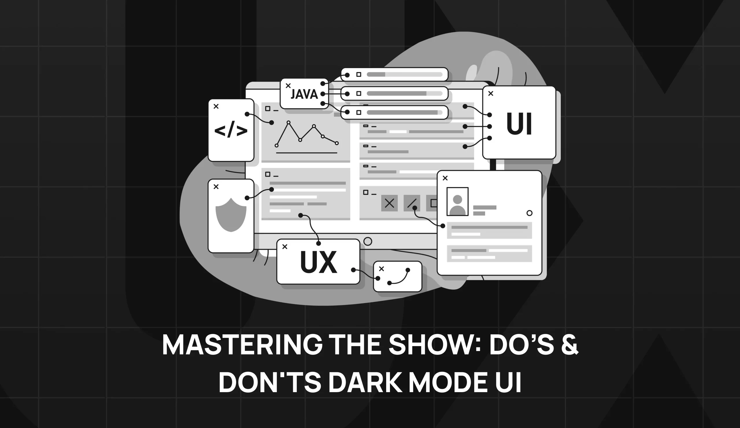
Mastering the Show: Do’s & Don'ts Dark Mode UI
Mastering the art of dark themes to create aesthetics is not as easy as it looks. It needs to be strategically done to design a UI to manage the colour palette with other design elements.
A designer must understand the dos and don’ts to ensure that the design is providing an optimal user experience.
#Do’s of Dark Mode UI
- Embrace Negative space:
When we talk about white space in a dark theme, then it’s not just what’s added but what element is left purposely to make the design look more appealing. The void around the design elements – the negative space affects the overall composition.
White space might not look important while designing dark mode interfaces, however, it actively enhances the structure. To get a clean and impactful design, a balance of positive and negative space is necessary.
White space guides the viewer through a visual journey and offers a moment for the eyes to rest and find the significant elements. Designing brand agencies like Pirxbrand know the art of balancing the negative space and giving the space for other elements to breathe.
- Emphasise visual content:
When designing the elements of dark mode, it’s essential to analyse the impact of each element. The dark mode is an opportunity with rich backgrounds and is a great stage for content to stand out against a high-contrast backdrop while designing captivating applications and websites. This stark contrast makes the images, graphics, videos and visuals in all their forms prominent.
The combination of a dark background with lighter visual elements establishes a clear and powerful visual hierarchy. It guides the visitor effortlessly and gathers their attention on the essential elements due to the clear contrast.
Platforms like Spotify or Netflix thumbnails, have dark backgrounds and beautifully demonstrate their impact.
- Enhance emotional branding:
The dark mode colors theme is responsible for a clutter-free experience as it gives time for the customer to respond emotionally to such UI websites and applications. And this is established by using the psychology of colour.
Every colour has a significant impact on our emotions, perceptions and decisions. Black colour evokes a sense of power, authority, stability and strength. It is the symbol of intelligence, sophistication, seriousness, control, mystery, drama and independence. Using this potent colour with contrast images creates a visual spectacle.
The colour should be used wisely as per the mood-setting technique. Selecting the colours should be a conscious decision to craft an emotional experience for the user.
- Improve usability:
As dark themes reduce eye strain, it is often used on apps and websites which are used at night and for a longer time. Such apps smartly adopt a dark colour palette to minimise fatigue on the eyes.
Many entertainment platforms use this theme for a relaxing bingeing time. However, for the flexibility some platforms give an option to choose between the light and dark mode.
On the other hand, digital platforms like Google Maps automatically transit to a darker interface during night hours.
Dark theme is not merely a trend, it’s a strategic design choice to give a much better user experience while keeping the health of their eyes in mind. As the screen hours are increasing over time, adding dark themes to any app or web will be in favour of using a platform for longer durations.
#Don’ts of Dark Mode UI
Text-heavy application:
Dark mode and text-heavy are incompatible partners. Bright text light in such mode affects the readability leading to eye strain. This applies to those applications where users engage with written content like blogs, new websites or e-books.
- Displaying a variety of content types:
A diverse range of content in dark mode is a challenge as it is significantly good for content like images and videos. Charts, graphs, icons and other elements against dark backgrounds lead to distraction, confusion and frustration among users. Avoid integrating different design content.
- Ignoring Colour Contrast:
Don’t ignore colour contrast as it is crucial for dark backgrounds to balance the other elements on it or else it can impact accessibility and usability. The lack of contrast affects the visual strain and makes it difficult for users to interact with the interface. WCAG guidelines and utilising contrast testing tools or hiring Pixabrand can help to understand the importance of contrast.
- Overcrowding the Interface:
Dark theme is aesthetic but it can appear heavier due to the overcrowded interface with elements. Focus on essential elements, use negative space and avoid using extra elements to keep the background clean and minimal.
Conclusion
Dark Theme Mode is the leading User Interface trend in 2023 and it’s gonna rule for the coming years for sure. The aesthetics and the sophistication it gives to your digital persona are different for all users. But, don’t forget to keep it interactive too, so your users can have a wholesome experience of using the app and website.
Pixabrand is your branding expert to create a dark mode that not only nails the aesthetics but also the usability of it.
TABLE OF CONTENTS
- 11 Dark Mode
- Avoid White Fonts
- Use Beyond Pure Black
- Don’t just invert the colour
- Focus on the Browser Indicators
- Dynamic Brand Presence
- Don’t Lose Brand’s Identity
- Communication Depth with Interface
- Avoid Shadows for Better UI
- Give User a Choice To Switch
- Testing Dark Mode with End-Users
- Pros and Cons
- Mastering the Show